


Kiểu tô dày (厚涂) nhìn thì có vẻ “pro”, nhưng nếu tách nhỏ thành từng bước như bộ ảnh bạn gửi thì quy trình thực ra rất rõ ràng: dựng form bằng màu, không lệ thuộc line, ưu tiên khối và không khí chung. Dưới đây là bản mở rộng chi tiết từ các bước trong hình, bạn có thể áp dụng cho Procreate, Photoshop hay Clip Studio Paint đều ổn.
English Below
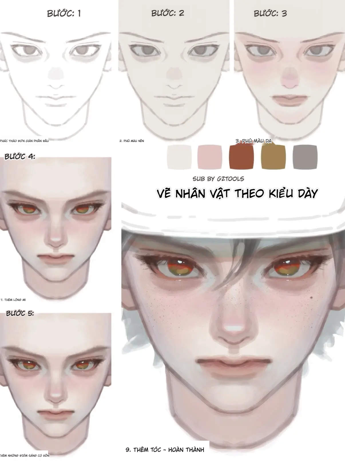
Phác thảo nhẹ phần đầu – dựng đúng trước đã
Mục tiêu của bước đầu không phải đẹp mà là “đúng”:
– Tạo một layer line riêng, giảm Opacity xuống khoảng 20–40%.
– Dùng cọ bút chì, cọ sketch hơi nhám (kiểu鉛筆 brush), phác nhẹ cấu trúc đầu: đường mép trán, gò má, hàm, vị trí mắt – mũi – miệng.
– Không cần vẽ lông mi, nếp nhăn hay chi tiết da, chỉ cần đặt đúng tỷ lệ: mắt nằm khoảng nửa chiều cao đầu, mũi ở giữa mắt và cằm, miệng nằm giữa mũi và cằm.
– Quan trọng: giữ cho đường line “mở”, không chồng quá nhiều nét, để sau này khi tắt line, màu vẫn dẫn được khối.

Tip nhỏ: ngay từ bước này, hãy xác định luôn ánh nhìn nhân vật – mắt hơi xếch, hay tròn, có mí dưới rõ không – vì toàn bộ “tâm hồn” sẽ xoay quanh hai con mắt này.
Phủ base skin thật phẳng – coi như trải “màu giấy”

Bước thứ hai là đặt lớp nền da:
– Tạo layer mới nằm dưới line.
– Chọn một màu da trung tính, hơi ngả xám hoặc vàng, saturation vừa phải (đừng chọn màu hồng cam rực quá).
– Dùng cọ mềm lớn, phủ kín toàn bộ mặt và cổ, có thể tràn nhẹ ra ngoài biên nếu thích, miễn silhouette mặt vẫn rõ.
– Đừng để lộ vùng trắng giấy; vùng nào cố tình để trắng (highlight mạnh) thì lát nữa thêm sau.
Lớp base này giống như bạn đang đổi màu tờ giấy: mọi layer phía trên sẽ dựa vào nó để hòa màu, nên nếu base quá tươi, cả bức sẽ bị “cháy da”.
Tăng tuần hoàn máu cho da – đặt vùng đỏ ấm
Bức ảnh bước 3 cho thấy gò má, chóp mũi và mí dưới bắt đầu ửng đỏ. Đây là lúc bạn “bơm máu” cho nhân vật:

– Chọn airbrush hoặc bất kỳ cọ mềm nào có mép fade nhẹ.
– Dùng các màu ấm: hồng da, đỏ gạch, cam đất. Có thể trộn 2–3 màu để da đa sắc hơn.
– Chấm vào:
• Hai gò má (vùng hình tam giác hướng về phía sống mũi).
• Chóp mũi và quanh cánh mũi.
• Mí dưới, khóe mắt, môi trên và môi dưới.
– Đừng blend quá kỹ; cứ để vùng đỏ hơi lốm đốm, nhìn sẽ giống mao mạch dưới da hơn là lớp phấn hồng bị xoa đều.
Nếu muốn nhân vật trông lạnh lùng hơn, có thể giảm bớt màu đỏ, chuyển sang hồng tím nhẹ. Ngược lại, muốn nhân vật hoạt bát, bạn đẩy tone cam nhiều hơn.
Trải da vùng tối – bắt đầu “tô dày” thực sự

Đây là bước quan trọng để da có khối:
– Chọn màu da tối hơn base khoảng 1–2 tông, nhưng nhiệt độ hơi lạnh hơn (ngả xám, tím hoặc nâu lạnh), tránh dùng nâu đỏ vì sẽ lẫn với vùng má hồng.
– Dùng cọ có cảm giác “dày” hơn: oil brush, acrylic, hoặc cọ custom có texture.
– Tập trung vào những vùng:
• Hốc mắt, dưới xương mày.
• Cánh mũi, hai bên sống mũi.
• Rãnh mũi–má.
• Mép môi trên, dưới môi, vùng lõm dưới môi (nhân trung – cằm).
• Dưới cằm, hai bên quai hàm.
• Hai bên thái dương, sát chân tóc.
– Khi blend, thay vì xoay tròn như tô phấn, hãy kéo theo mặt phẳng: ngang ở má, dọc ở sống mũi, xéo ở hốc mắt. Như vậy khối mặt sẽ thuyết phục hơn.
Sau bước này, dù chưa vẽ chi tiết, bạn đã phải nhìn thấy rõ: mắt nằm sâu hơn, mũi nhô ra, môi trồi lên khỏi mặt phẳng.
Khóa form, thêm màu lạnh – kéo nhân vật ra khỏi trạng thái “bột bột”

Đây là lúc bạn tinh chỉnh lại quan hệ sáng – tối:
– Dùng cọ cạnh hơi vuông, chọn màu nâu lạnh hoặc xám đậm, đi lại:
• Viền mũi, đặc biệt phần cánh và chân mũi.
• Viền mí mắt trên, mí dưới.
• Mép môi, rãnh giữa môi và cằm.
– Thêm một ít màu lạnh (xanh lam nhạt, xám xanh) vào:
• Vùng bóng râu quanh miệng, cằm.
• Bọng mắt, vùng dưới mắt.
• Một chút ở cổ, gốc tai, để da không bị “hồng toàn thân”.
– Thường xuyên tắt/bật layer line: nếu khi tắt line mà gương mặt vẫn rõ khối, vẫn ra biểu cảm, nghĩa là bạn đi đúng hướng; nếu tắt line một phát là mặt bị phẳng, hãy quay lại tăng tương phản shadow.
Mục tiêu của bước này là khiến gương mặt đứng vững bằng khối màu, không phụ thuộc vào đường viền.
Vẽ mắt cho “ăn tiền” – nơi người xem nhìn vào đầu tiên

Trong ảnh, từ bước 4 trở đi, mắt chính là phần được chăm kỹ nhất:
– Fill “tròng trắng” bằng màu xám rất nhạt, tuyệt đối không dùng trắng tinh – như vậy mắt sẽ chìm vào tổng thể da.
– Vẽ mống mắt:
• Base: một màu tối gần với màu bạn muốn (nâu đỏ, vàng cam, xanh lá…), phủ toàn bộ mống.
• Thêm vòng sáng gần tâm mắt để tạo cảm giác ánh sáng xuyên qua.
• Viền mống bằng màu đậm hơn để mắt có “khung”.
– Chấm phản quang:
• Một chấm trắng hoặc gần trắng, đặt lệch về phía nguồn sáng.
• Có thể thêm một vệt dài nhỏ trên mí để giả cảm giác nước mắt.
– Viền mi trên bằng màu nâu đậm hoặc đen, kéo dài nhẹ ở đuôi mắt; mi dưới thì dùng màu mềm hơn, ít đậm hơn để không bị “kẻ eyeliner cả hai bên” quá dữ.
Mắt làm xong chuẩn thì kể cả da, môi chưa hoàn thiện, gương mặt vẫn đã có “hồn”.
Gắn mi giả – dày nhưng vẫn thanh

Bước tiếp theo trong ảnh là thêm lông mi:
– Dùng cọ đầu nhọn, độ nhạy lực bút tốt, vẽ theo cụm 3–5 sợi, hướng theo độ cong mí.
– Ở mí trên:
• Gốc mi dày, đầu mi mảnh.
• Không cần vẽ kín 100%, hãy để vài khoảng hở cho thoáng.
– Ở mí dưới:
• Chỉ cần 3–6 sợi ngắn, đặt ở giữa và gần góc ngoài; tránh kẻ dày cả hàng kẻo mặt bị “giả”.
– Có thể thêm một đường eyeliner mờ ôm theo hàng mi trên để tạo cảm giác mắt sắc hơn mà không quá “makeup nặng”.
Nếu style bạn hướng tới là androgynous / trung tính, chỉ cần làm mi trên, mi dưới giữ rất nhẹ là đủ.
Làm nổi “điểm sáng trong tâm hồn” – highlight đúng chỗ

Sau khi shadow và mắt đã ổn, tới lúc thêm highlight:
– Dùng một cọ nhỏ, mép hơi cứng, chọn màu gần trắng nhưng hơi ngả vàng hoặc hồng.
– Chấm highlight ở:
• Đỉnh sống mũi và chóp mũi.
• Nhân trung, mép trên môi trên, rìa dưới môi dưới.
• Đỉnh gò má, kéo nhẹ về phía thái dương.
• Một ít ở trán nếu muốn da bóng trẻ trung.
– Ở mắt:
• Thêm highlight bé xíu ở khóe mắt, mép mí dưới chỗ gần nguồn sáng.
• Nhấn nhẹ trên viền dưới mống mắt để mắt long lanh hơn.
Nguyên tắc: highlight nên xuất hiện ở những vùng quay mặt trực tiếp về phía nguồn sáng, không rải lung tung. Càng ít nhưng đúng chỗ, da càng sang.
Thêm tóc, tàn nhang, chi tiết cuối – khóa mood bức tranh

Khung cuối cùng trong bộ ảnh là nhân vật đã có tóc, tàn nhang, nốt ruồi, tổng thể rất sống động:
– Tóc:
• Tạo group layer riêng cho tóc, nằm trên da nhưng dưới một số layer hiệu ứng (nếu có).
• Chọn 2–3 tông cùng họ màu: base, bóng, highlight.
• Đầu tiên tô tóc như một khối lớn theo hướng lọn; sau đó mới chia nhỏ bằng những vệt shadow – highlight, tránh vẽ từng sợi ngay từ đầu.
– Tàn nhang, texture da:
• Dùng brush hạt nhỏ (speckle, splatter), Opacity thấp 10–20%.
• Rải chủ yếu ở mũi, má, trán; vài đốm ở cằm hoặc dưới mắt cho tự nhiên.
• Có thể dùng Eraser mềm xóa bớt những đốm quá đậm hoặc nằm sai vị trí.
– Nốt ruồi, khuyết điểm:
• Một hai nốt ruồi nhỏ, màu nâu đậm, đặt ở gần mắt hoặc má sẽ giúp nhân vật có điểm nhớ.
• Thêm quầng thâm nhẹ, vệt đỏ mũi, môi khô… tùy tính cách nhân vật.
– Màu tổng thể:
• Cuối cùng, dùng Color Balance, Curves hoặc Hue/Saturation nhẹ để unify màu.
• Ví dụ: kéo chút cyan – blue vào shadow để bức tranh mát hơn, hoặc thêm yellow – red vào midtone để tổng thể ấm lên.
Sau bước này, bạn đã có một chân dung kiểu dày hoàn chỉnh: da nhiều lớp, mắt có chiều sâu, tóc hòa với tổng thể, không bị cảm giác “da 1 layer, mắt 1 layer”.
Một vài lưu ý để luyện cho nhanh lên tay
– Đừng cố làm sắc nét từng bước. Hãy cho phép bản thân “lem nhem có kiểm soát” ở giai đoạn giữa, rồi dần dần gom lại.
– Thường xuyên zoom out để nhìn tổng thể, đừng chỉ zoom 300% chăm từng pixel.
– Lật canvas trái/phải để bắt lỗi lệch khối.
– Giữ lại file ở nhiều mốc bước (giống chuỗi hình bạn gửi) để tự so sánh: bước nào làm da “lên đời” nhiều nhất, bước nào dễ phá form nhất.
Chỉ cần lặp lại quy trình này với vài gương mặt khác nhau (già – trẻ – nam – nữ – androgynous), bạn sẽ dần nắm được logic “tô dày”: luôn bắt đầu từ base phẳng, đặt máu, xây shadow lạnh, khóa form, rồi mới vào chi tiết mắt – mi – highlight – tóc. Lúc đó nhìn reference hay tranh artist khác, bạn cũng tự tách được họ đang làm gì ở từng lớp màu.
Ok, đây là bản tiếng Anh của toàn bộ quy trình “vẽ chân dung kiểu dày” nha:
PAINTING A THICK-RENDERED PORTRAIT STEP BY STEP
(digital “厚涂” workflow for Procreate / Photoshop / CSP)
Thick rendering looks super pro and intimidating at first, but if you break it down like in your reference images, the process is actually very clear. The whole idea is: build the face with shapes and colors instead of relying on harsh lineart, and let the skin feel layered and alive.
Below is the full breakdown in English so you can reuse it for tutorials or captions.
Light sketch of the head – get it “right” before you get it “pretty”
The goal of the first step is accuracy, not beauty.
– Make a separate line layer and lower its opacity to around 20–40%.
– Use a pencil-type brush to lightly sketch the head: forehead, cheekbones, jawline, and the position of the eyes, nose and mouth.
– Don’t bother with lashes, wrinkles or skin details yet; just keep the basic proportions correct: eyes around the middle of the head, nose halfway between eyes and chin, mouth halfway between nose and chin.
– Keep your lines open and loose instead of piling strokes on top of each other. Later when you turn lineart off, the colors still need to carry the form.
Tip: decide the character’s gaze from this stage – slightly upturned eyes, droopy eyes, sharp or soft – because the whole “soul” of the portrait will revolve around the eyes.
Lay down a flat skin base – think of it as your “paper color”
Now we set the stage for all the later layers.
– Create a new layer under the sketch.
– Choose a neutral skin tone with a bit of gray or yellow in it, and keep the saturation low to medium.
– With a big soft brush, cover the entire face and neck evenly.
– Don’t leave random white gaps; any pure white you want (strong highlights) will be added later on purpose.
This base is literally the “paper color” of your painting. If it’s too bright or too pink, the whole portrait will end up looking over-exposed or sunburnt.
Add blood circulation – put the warm blush in
In the third step of your reference, the cheeks, nose tip and eyelids start to warm up. This is where you “pump blood” into the skin.
– Use an airbrush or any soft brush.
– Pick warm tones: peach pink, brick red, soft orange-brown. You can use 2–3 hues to keep the skin varied.
– Tap and softly brush over three main areas:
• Both cheeks (a triangular area pointing toward the nose bridge).
• The nose tip and around the nostrils.
• Lower eyelids, waterline, lips.
– Don’t over-blend. Let the blush stay a little patchy and hazy – that looks more like blood under the skin than perfectly blended makeup.
If you want the character to look colder or more tired, shift these warm tones toward mauve/purplish pink. If you want them energetic and lively, lean more into orange.
Block in the darker planes – start the actual thick rendering
This is where the face starts to gain depth.
– Choose a skin color 1–2 values darker than your base, but cooler in temperature (a bit more gray, purple or cool brown).
– Switch to a denser brush with more “body” (oil, acrylic or any textured brush).
– Focus on the following areas:
• Eye sockets, under the brow ridge.
• Sides of the nose and the wings of the nose.
• Nasolabial folds (nose–to–mouth lines).
• Under the lower lip and the dip between lip and chin.
• Under the chin and along the jawline.
• Temples and near the hairline.
– When you blend, follow the planes instead of scrubbing in circles: horizontal strokes on cheeks, vertical on the nose, diagonal around the eyes. That way the structure stays believable.
After this step, even without details, you should already feel the eyes sitting deeper, the nose sticking out, and the lips protruding from the face.
Lock the form, add some cool tones – stop the skin from looking “too pink”
Time to refine the light–shadow relationship and remove the “soft mushy” feeling.
– Take a brush with a slightly harder, squarer edge. Pick a cool brown or grayish dark tone.
– Reinforce:
• The nose edges, especially the wings and the base.
• Upper and lower eyelid rims.
• Lip contour, the groove between lip and chin.
– Introduce a bit of cool color (pale blue, blue-gray, desaturated teal) into:
• Beard area around the mouth and chin.
• Eye bags and under-eye area.
• Parts of the neck and under the jaw.
– Frequently toggle the sketch layer on and off. If the face still reads clearly when the lineart is off, you’re building the form with color correctly. If turning the line off makes everything flat, go back and push your values more.
The goal of this stage is to make the portrait stand solidly on its own, supported by light and shadow, not by outlines.
Paint the eyes – the main focal point
From step 4 onwards in your images, the eyes get the most attention – and that’s exactly how it should be.
– For the sclera (“white of the eye”), use a very light gray, not pure white. Real eyes are never pure white.
– Iris:
• Lay a dark base color for the iris.
• Then add a lighter ring inside to mimic light passing through the iris.
• Outline the iris with a darker ring to give it a “frame”.
– Highlights:
• Add a small bright dot or two slightly off the pupil, on the side facing the light source.
• Optionally, add a soft little highlight along the lower eyelid edge to suggest moisture.
– Line the upper lid with a dark brown or black, extending the outer corner slightly. The lower lid line should be softer and lighter to avoid looking over-made-up.
If the eyes look convincing, the portrait will feel alive even if other parts are not fully polished yet.
Add lashes – thick but still tidy
Next step in your reference is the eyelashes:
– Use a sharp, pressure-sensitive brush. Draw lashes in clusters of 3–5 hairs instead of single random hairs.
– Upper lashes:
• Roots are thick, tips are thin.
• Not every millimeter needs a lash – leaving small gaps keeps them airy.
– Lower lashes:
• Only a few short strokes in the middle and outer corner.
• If there are too many, the character instantly looks like they’re in full drag makeup.
You can also drop a very soft eyeliner following the upper lash line to make the eyes sharper without screaming “heavy makeup”.
Bring out the “light in the soul” – targeted highlights
Once shadows and eyes are in place, time for highlights:
– Take a small, semi-hard brush and a color close to white but slightly warm (a touch of yellow or pink).
– Hit these spots:
• The bridge of the nose and the tip.
• Philtrum (between nose and upper lip).
• The bottom edge of the lower lip.
• The highest point of each cheekbone, fading toward the temples.
• Optionally, a bit on the forehead if you want a more dewy look.
– On the eyes:
• Enhance the tear duct and lower lid with tiny bright accents.
• Strengthen the existing catchlights if needed.
Rule of thumb: highlights should only appear on surfaces directly facing the light source. Fewer but well-placed highlights make the skin look expensive; too many everywhere just make it greasy.
Hair, freckles and final polish – lock in the mood
The last frame in your sequence shows the character with hair, freckles and tiny defects – this is what pushes the portrait from “nice study” to “living person”.
– Hair:
• Put hair on a separate group above the skin but below any global effects layers.
• Choose 2–3 hues from the same color family: base, shadow and highlight.
• First, paint the hair as big shapes following the flow of the strands; only afterwards carve out smaller sections and a few single hairs.
– Freckles and skin texture:
• Use a small speckle or splatter brush with low opacity (10–20%).
• Scatter freckles mainly over nose, cheeks and a bit on forehead; add fewer on chin or under eyes.
• Erase or soften any freckles that are too dark or placed awkwardly.
– Moles and imperfections:
• Place one or two tiny dark moles near the eyes or on the cheeks to give the face a memorable point.
• You can also hint at eye bags, redder nose, chapped lips depending on the character’s personality.
– Global color:
• Finish with a gentle Color Balance, Curves or Hue/Saturation adjustment to unify everything.
• For a cooler atmosphere, push cyan/blue into the shadows; for a warmer, softer look, push yellow/red into the midtones.
After this, you’ve got a fully rendered “thick paint” portrait: multi-layered skin, deep eyes, hair that belongs to the same color world, nothing feeling like a flat sticker on top.
Extra tips to level up faster
– Don’t try to be ultra-clean at every stage. Allow “controlled mess” in the middle steps, then gradually tighten things up.
– Zoom out often to judge the overall read instead of obsessing over pixels at 300%.
– Flip the canvas left/right regularly to catch structural mistakes.
– Save versions at key steps (like in your image set) so you can look back and analyze: which step made the biggest difference, which step tends to break the form.
Once you repeat this workflow on different faces (older, younger, male, female, androgynous), you’ll start to internalize the logic of thick rendering: flat base first, then blood, then cool shadows to sculpt the form, then eyes–lashes–highlights–hair. After that, looking at references from other artists, you’ll easily “decode” which step they’re at and how they built their layers.

